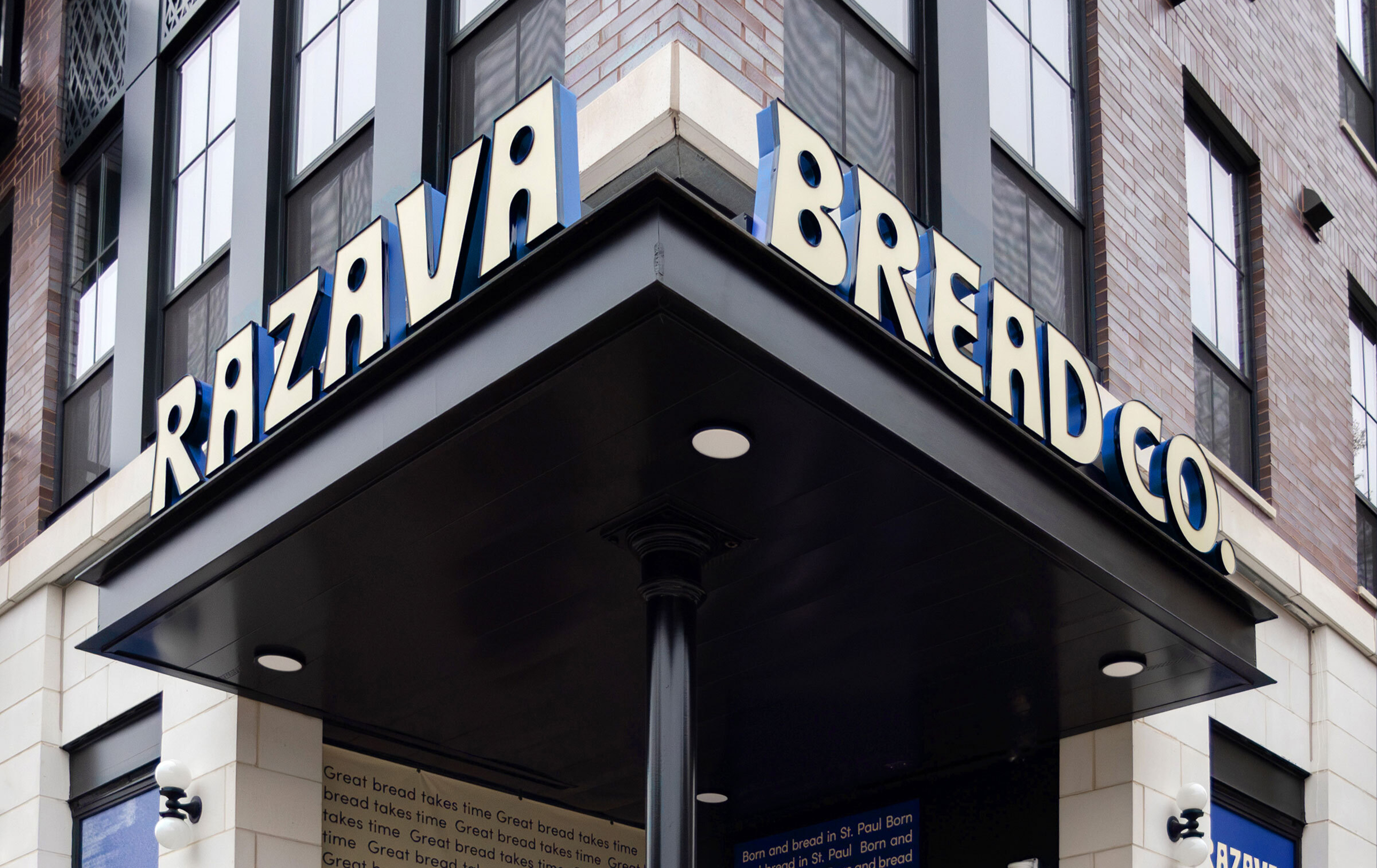
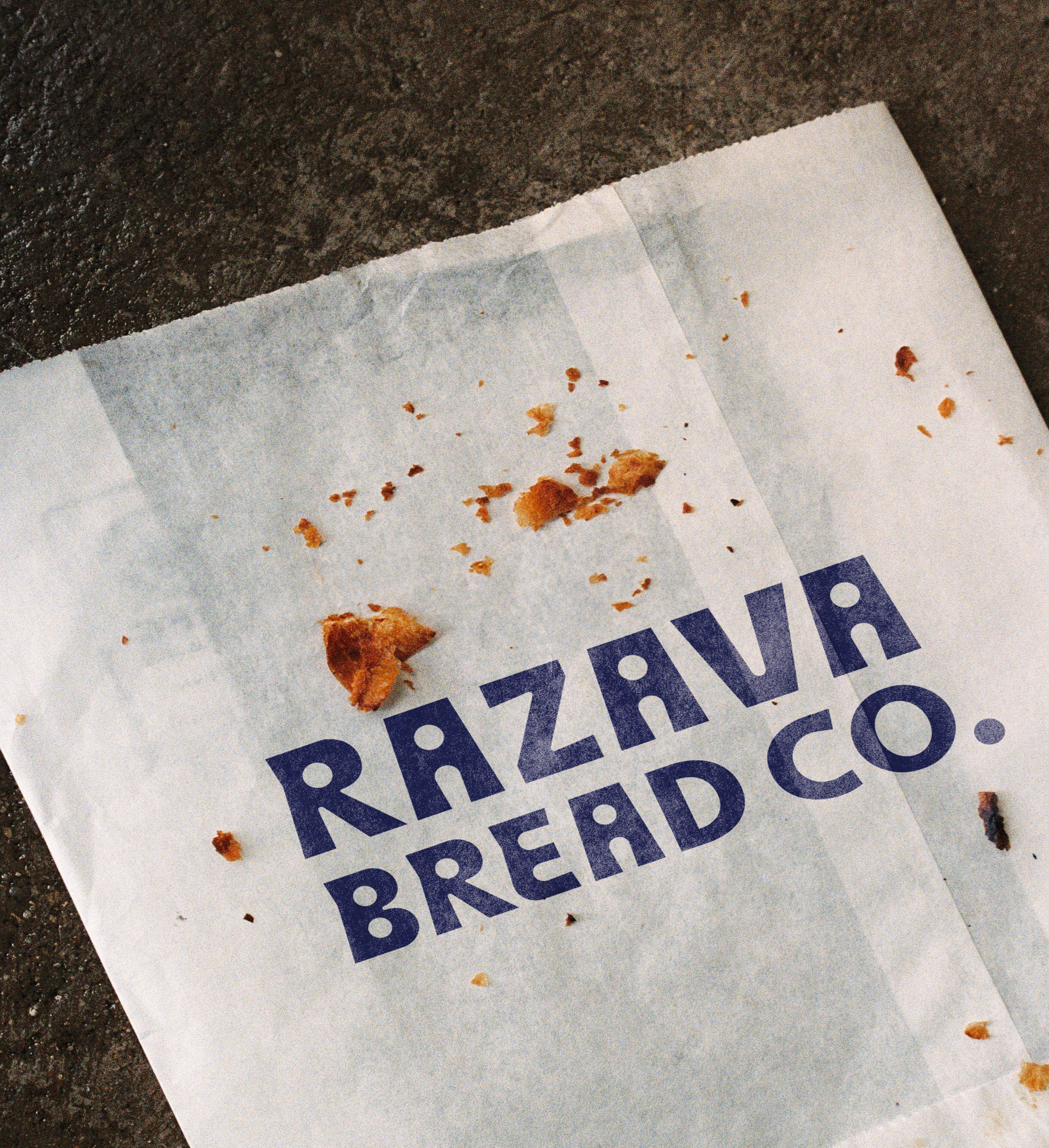
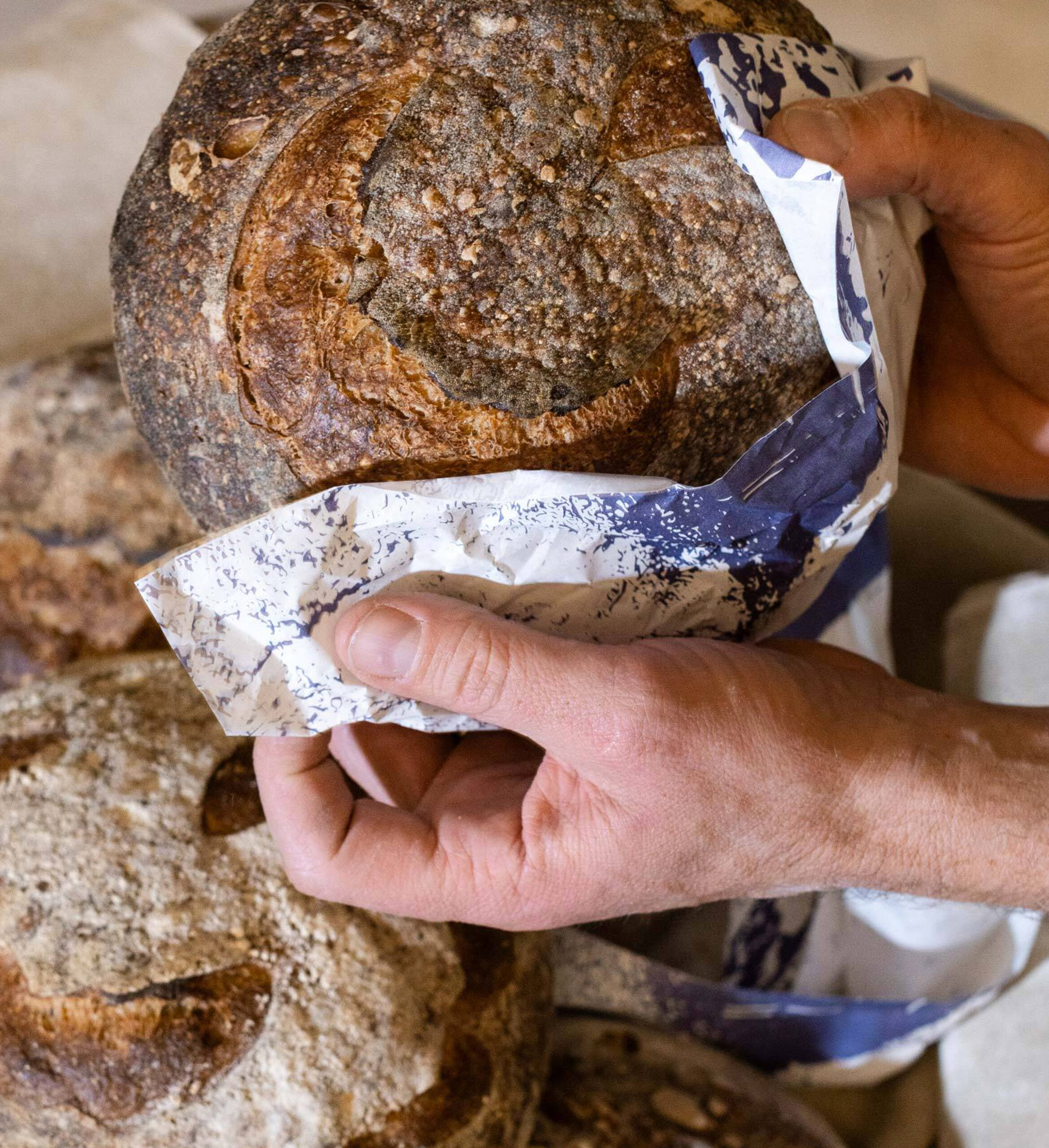
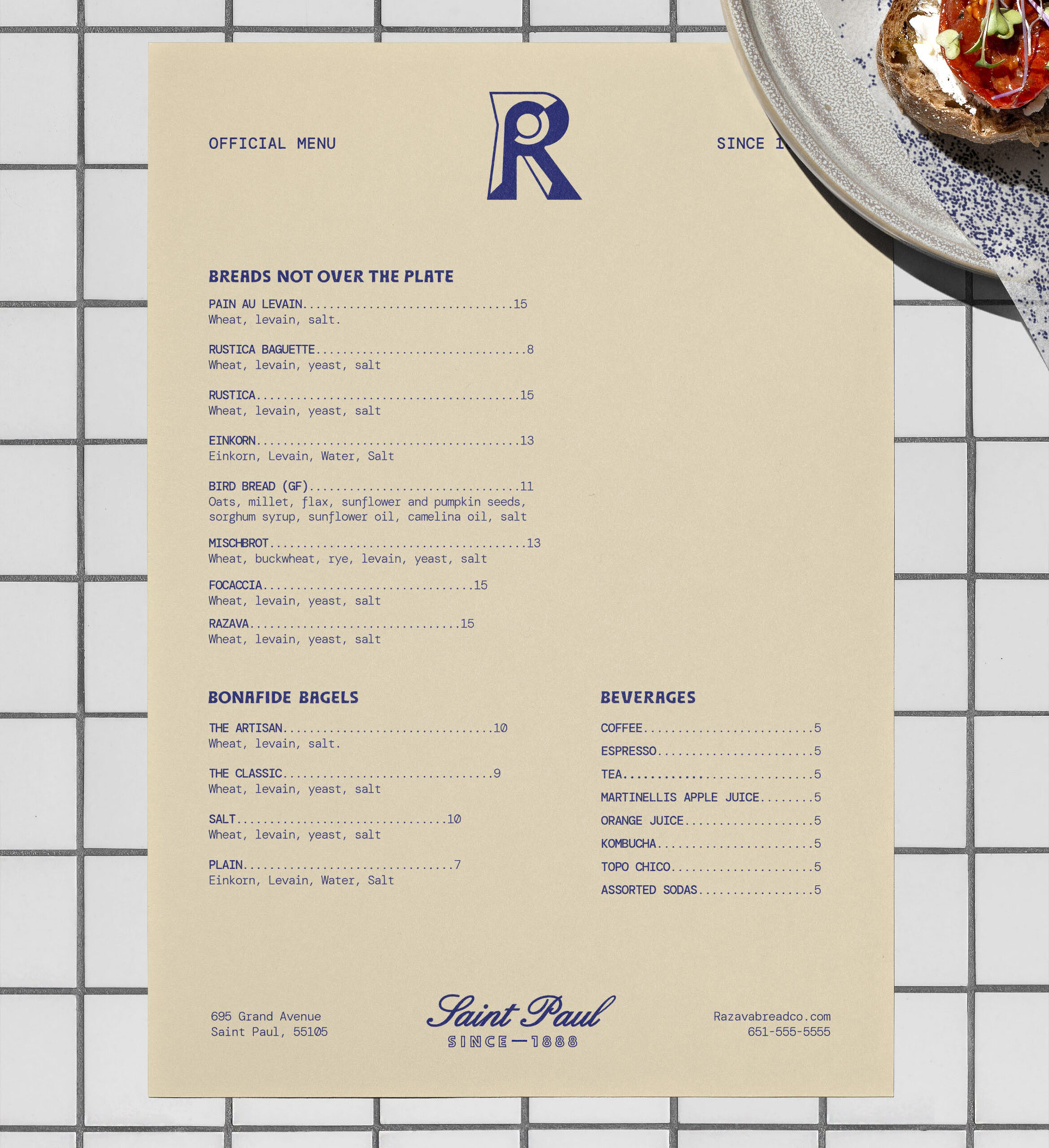
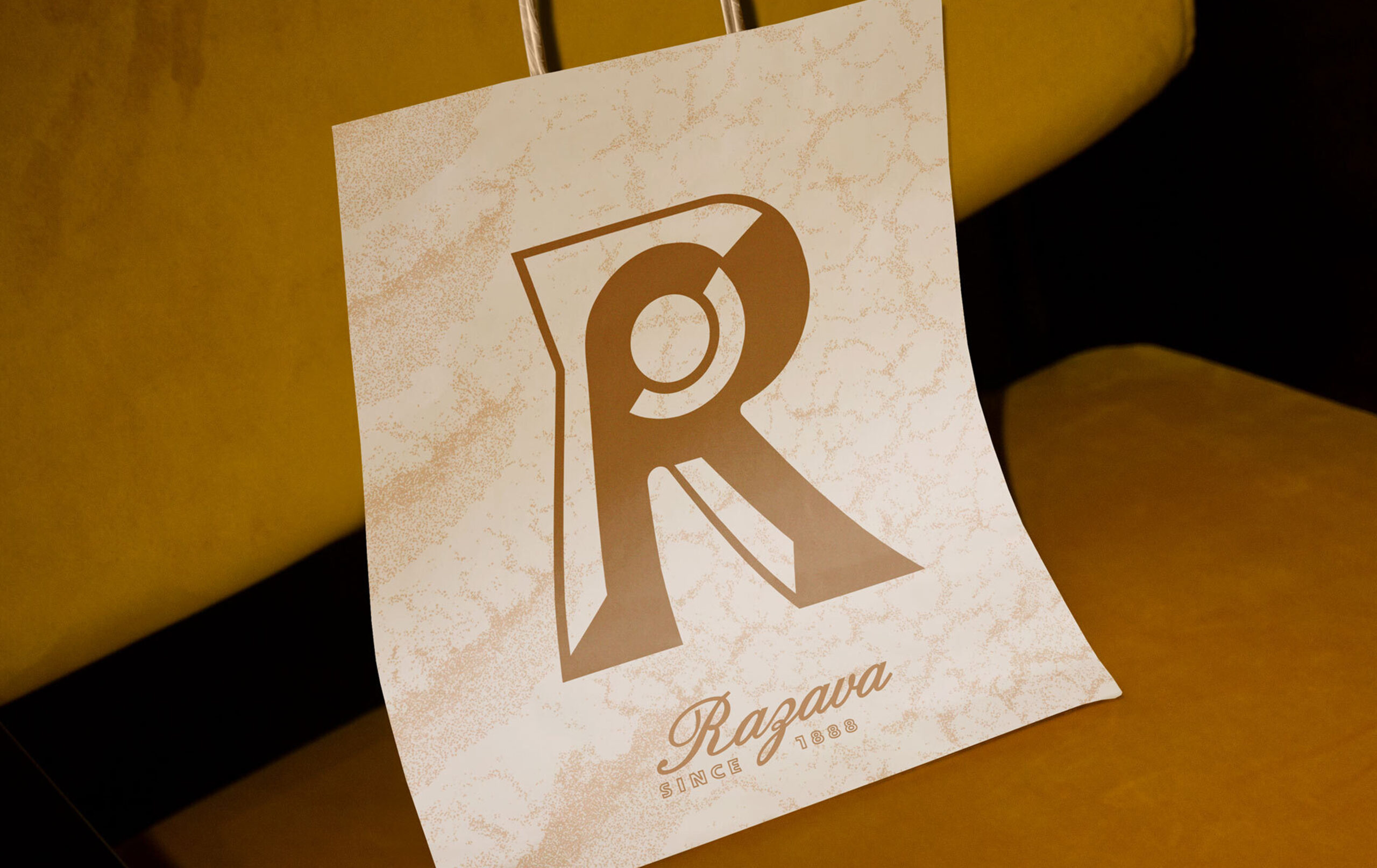
Razava
Time-honored
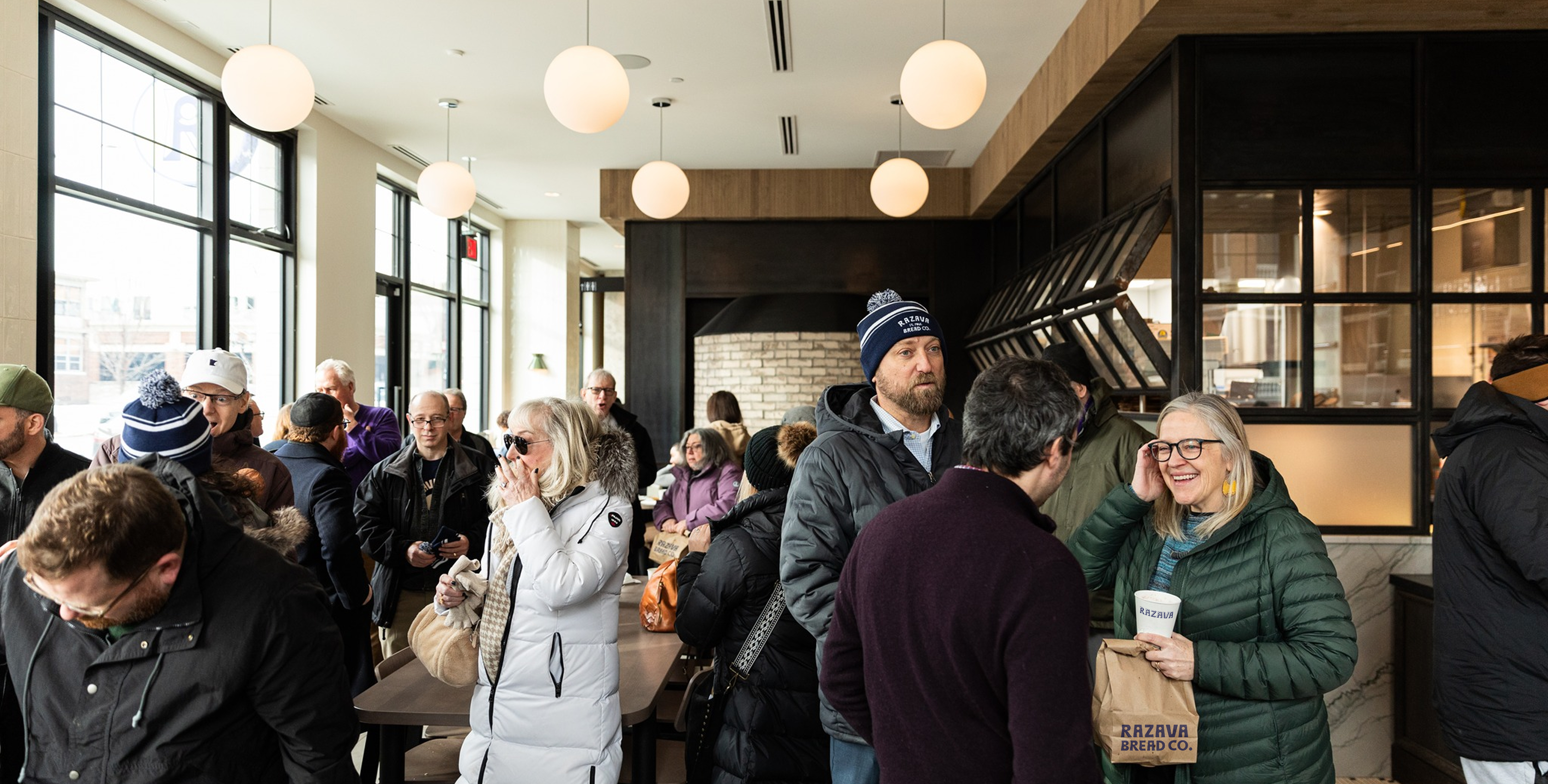
togetherness.
Most bakeries focus on speed and efficiency. Razava Bread Co. was built differently. From the start, the brand needed to reflect the same care, patience, and tradition as the bread itself.
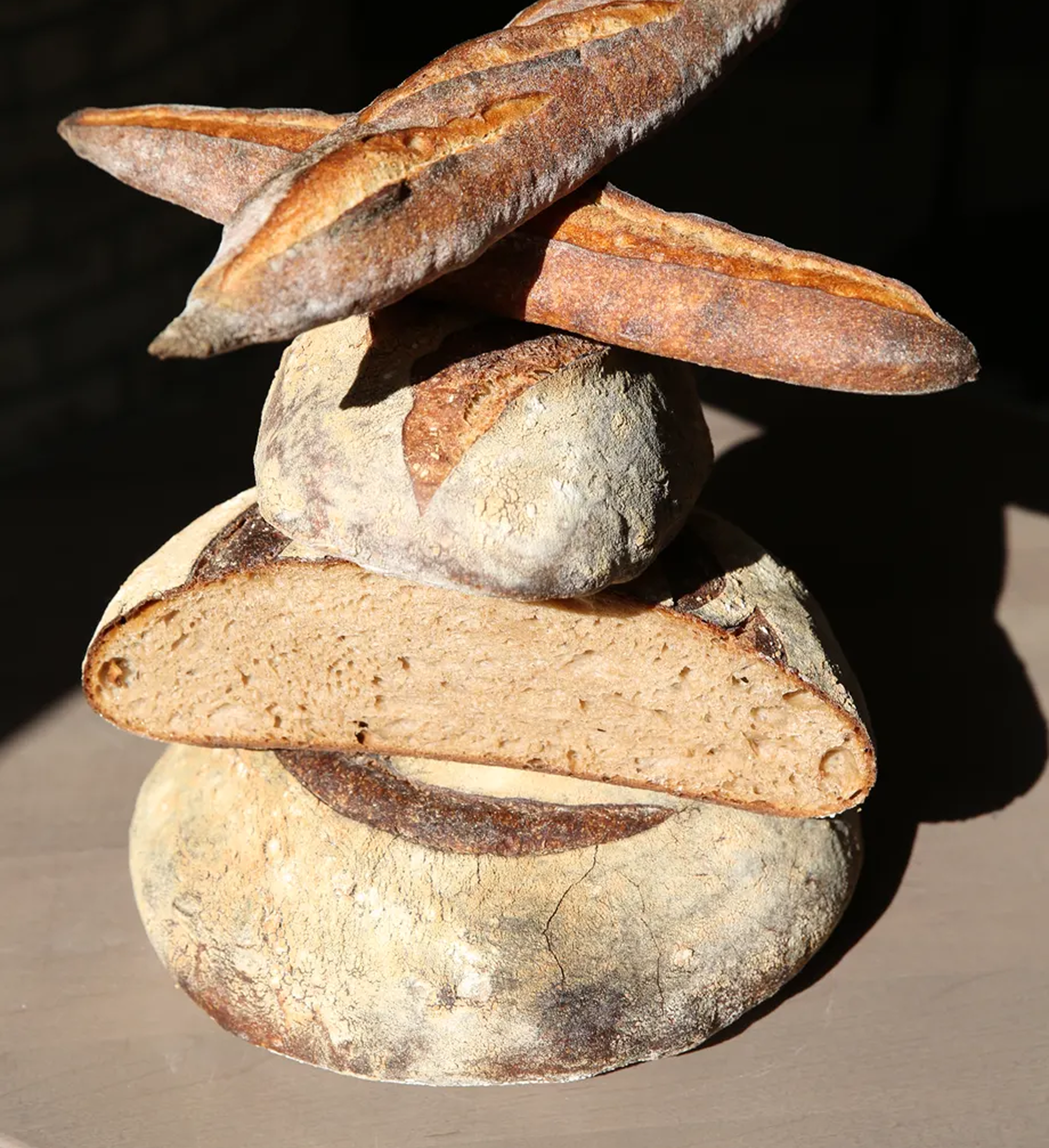
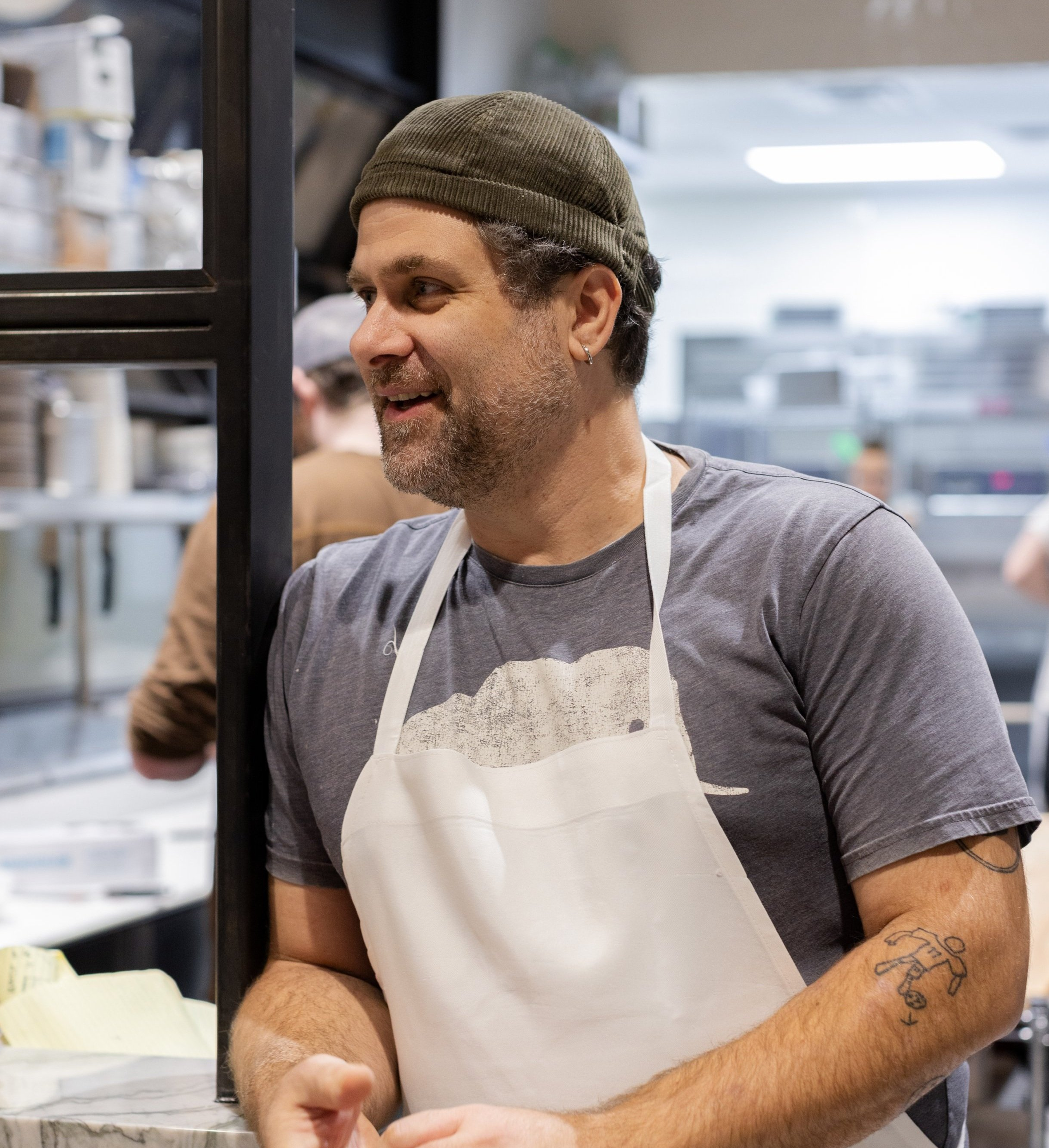
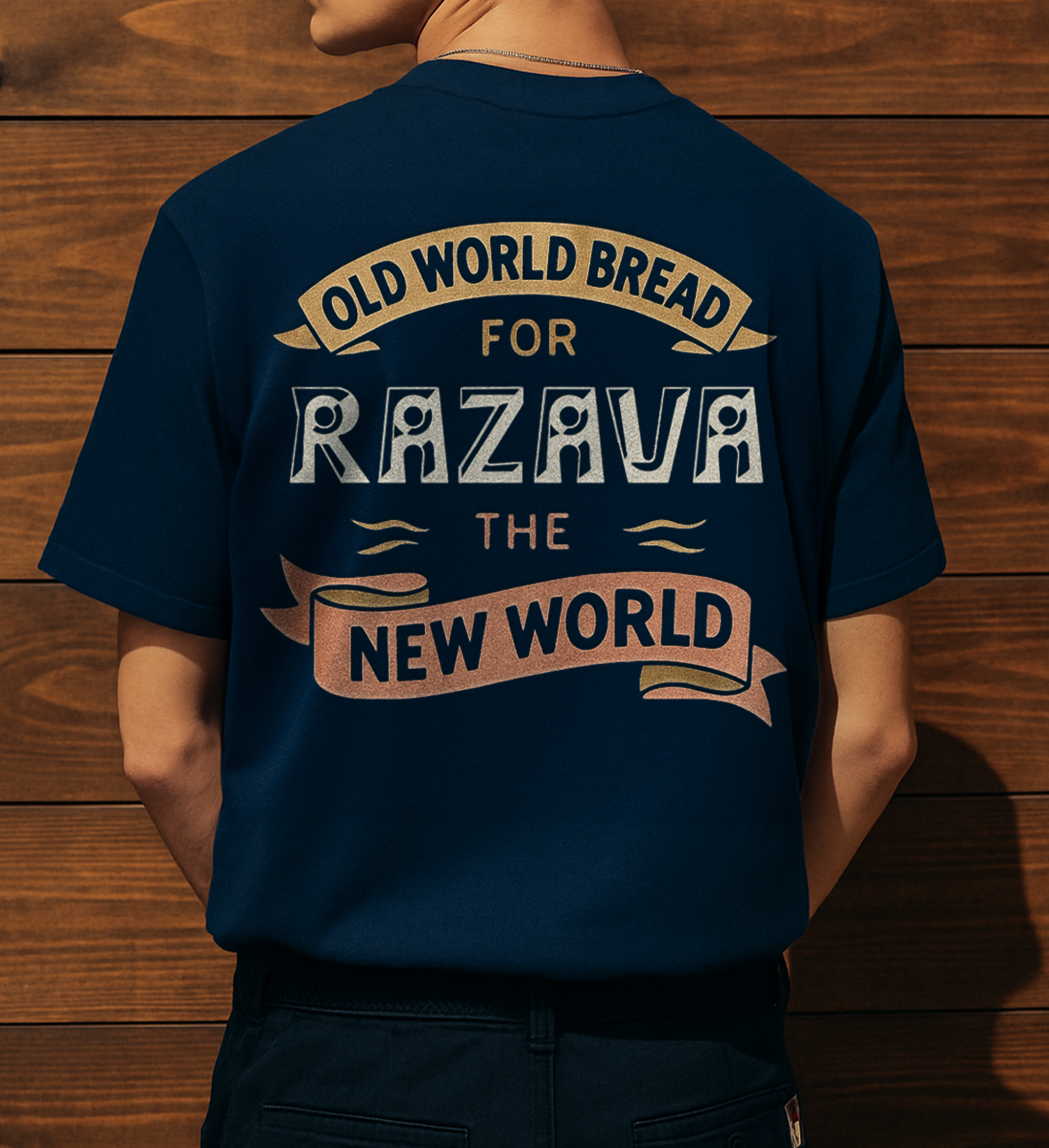
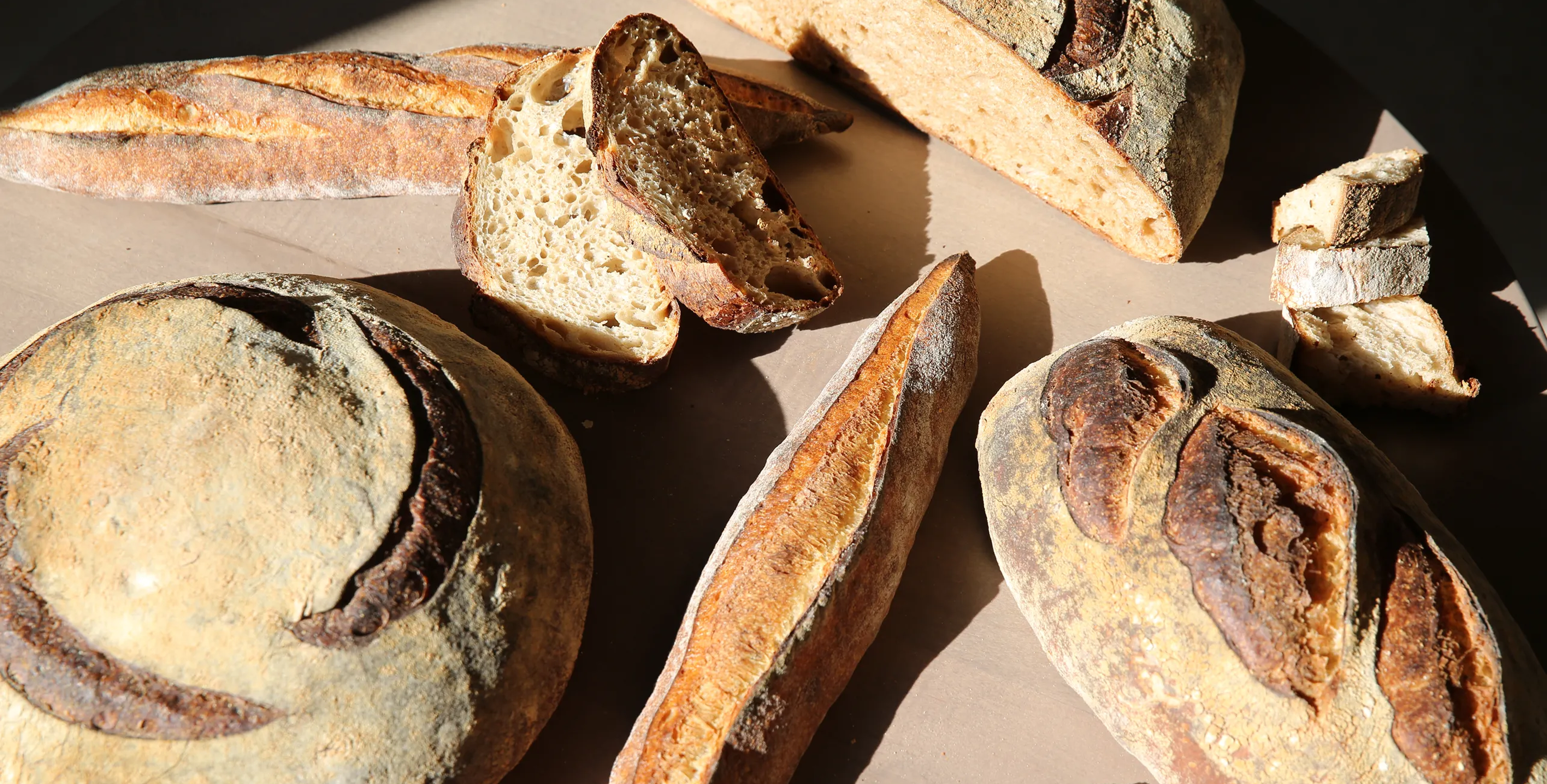
It began with a name—Razava. A word passed down in Alex’s family, tied to a dark, seedy loaf his great-grandparents baked in the 1920s and ’30s. Made from whole, unrefined grains, it was rich, hearty, and full of history. When head baker Omri Zin-Tamir traced its origins, he found echoes of it in Eastern European baking—and a family member’s memory of a nourishing, old-world bread.
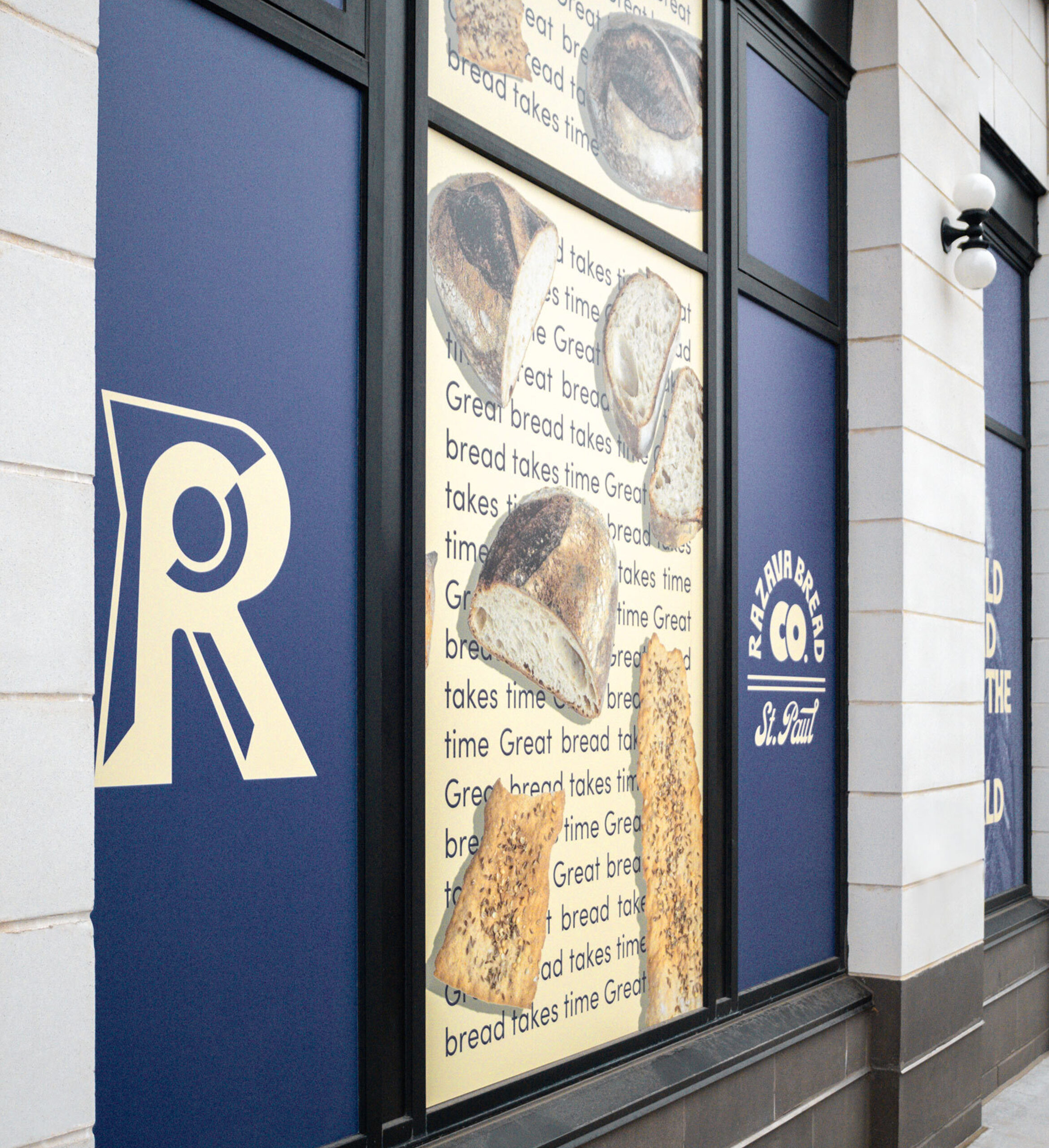
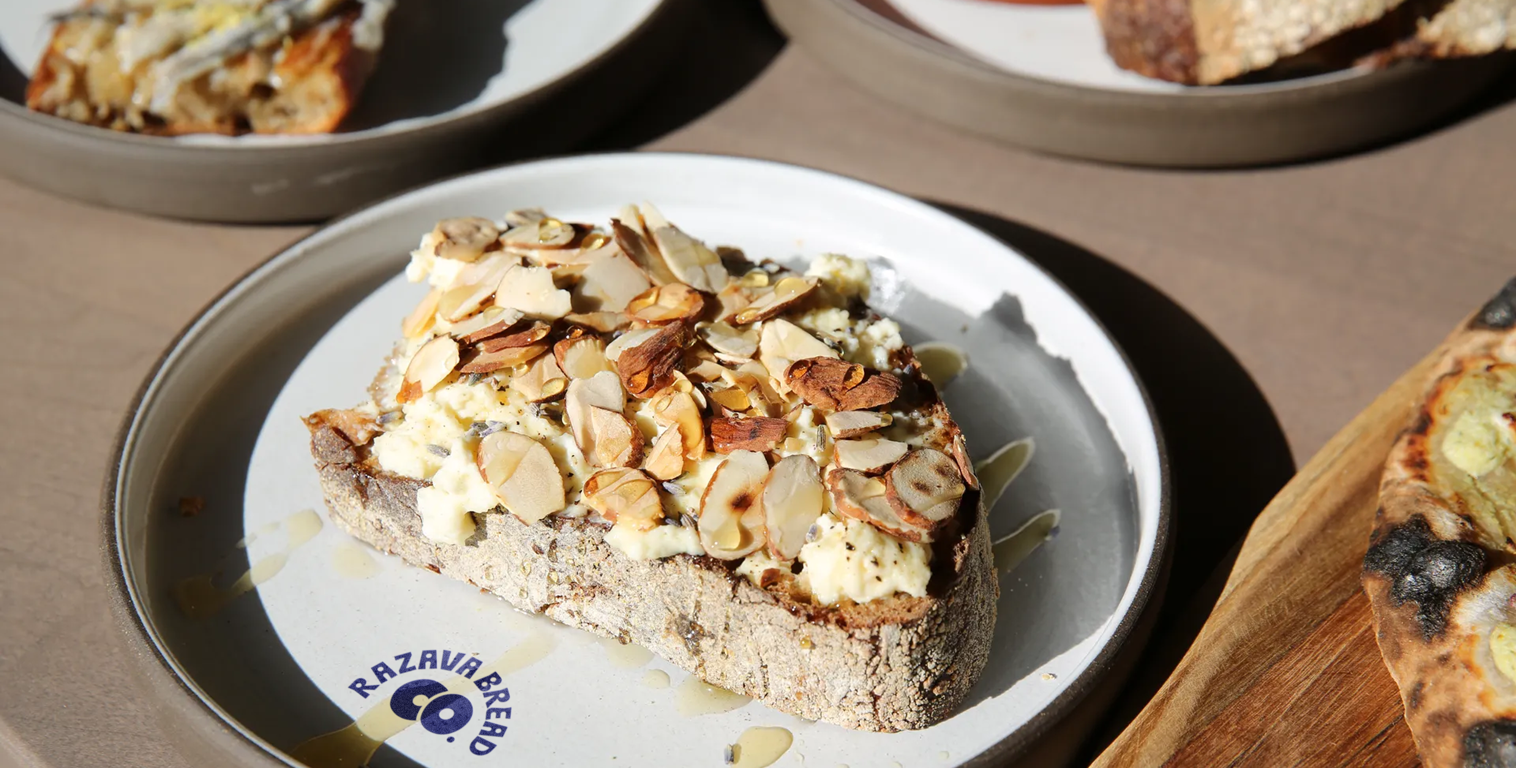
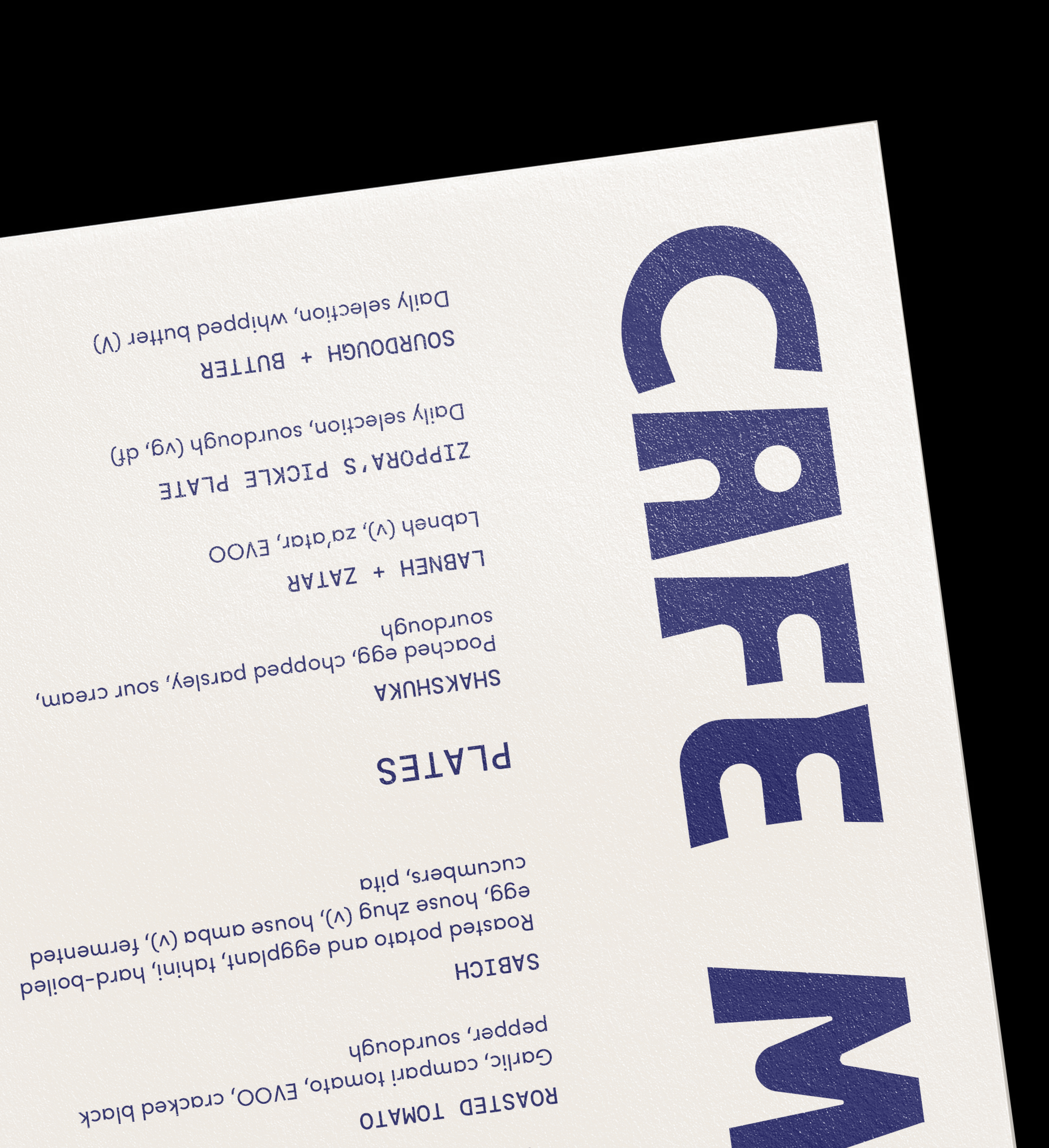
That story became the foundation of the brand. The challenge wasn’t just designing a logo or choosing colors—it was about translating time-honored techniques, slow fermentation, and natural ingredients into something tangible. The identity needed to feel grounded yet forward-thinking, traditional yet alive. From fermenting and proofing to the final crust, every step of the bread-making process inspired the design.
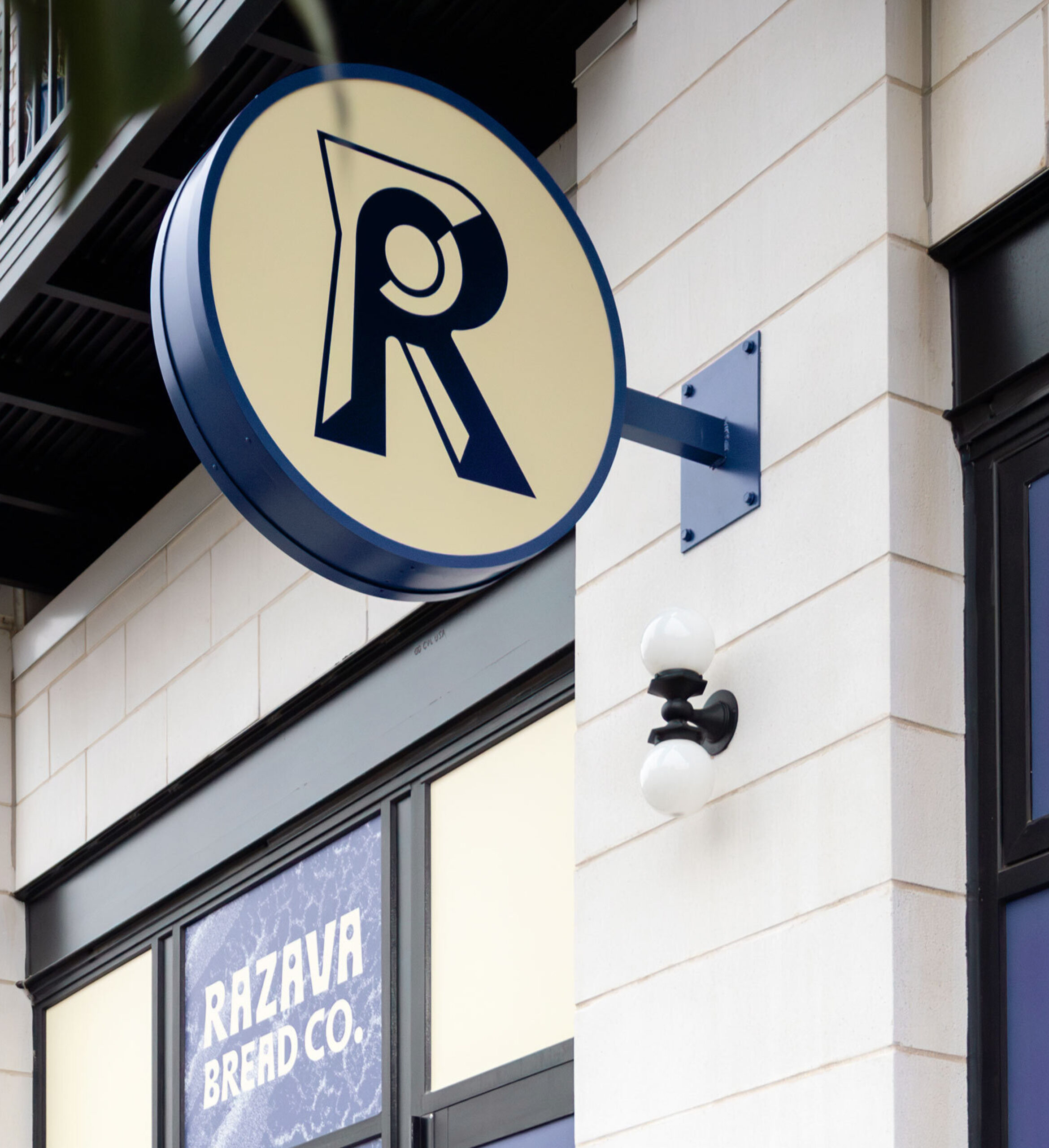
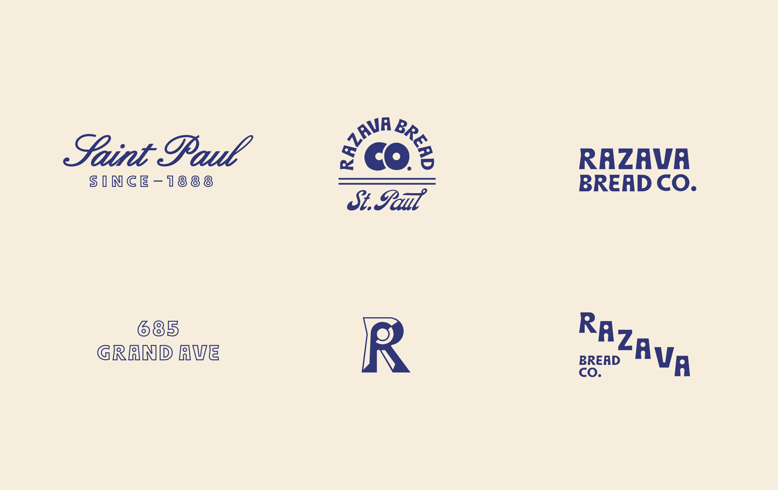
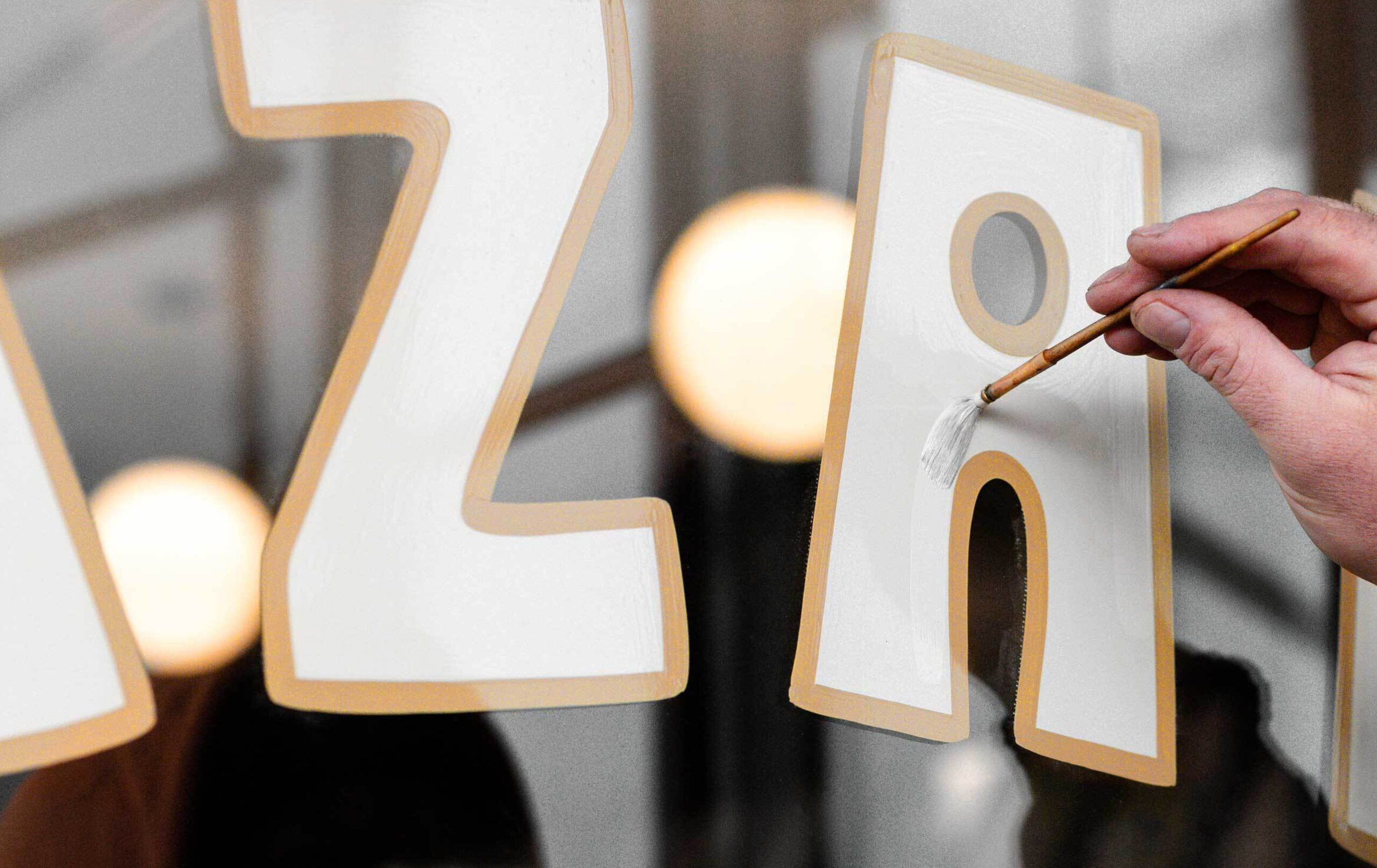
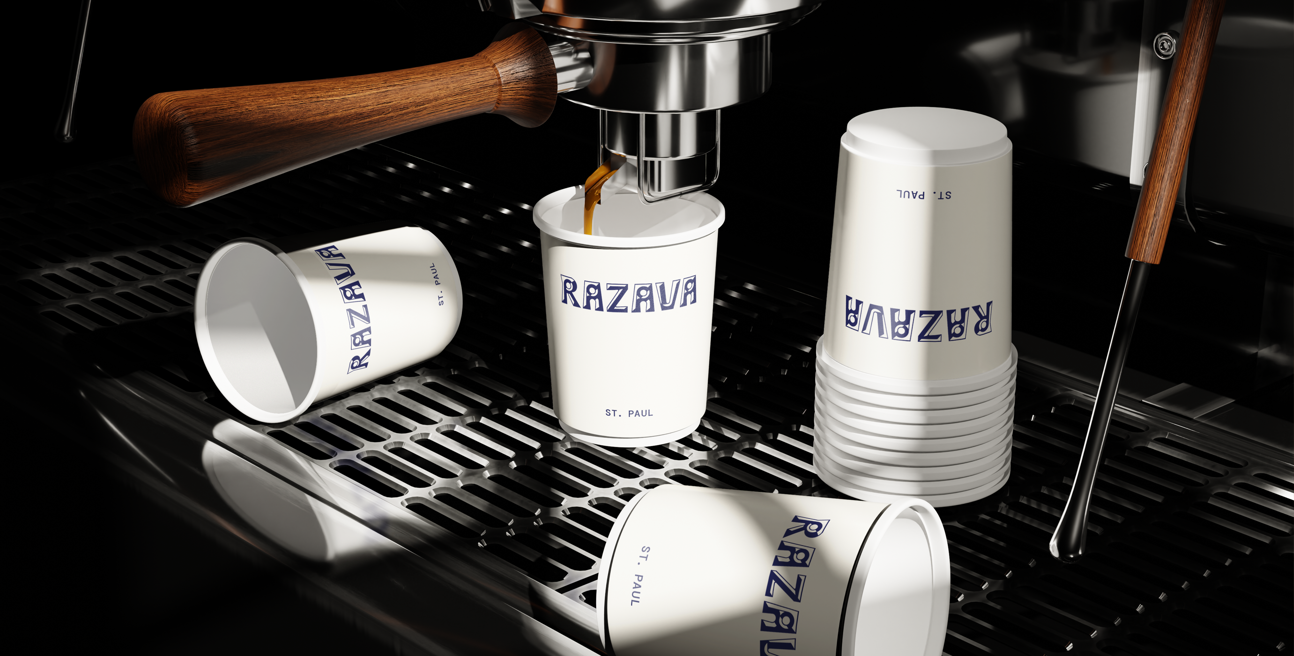
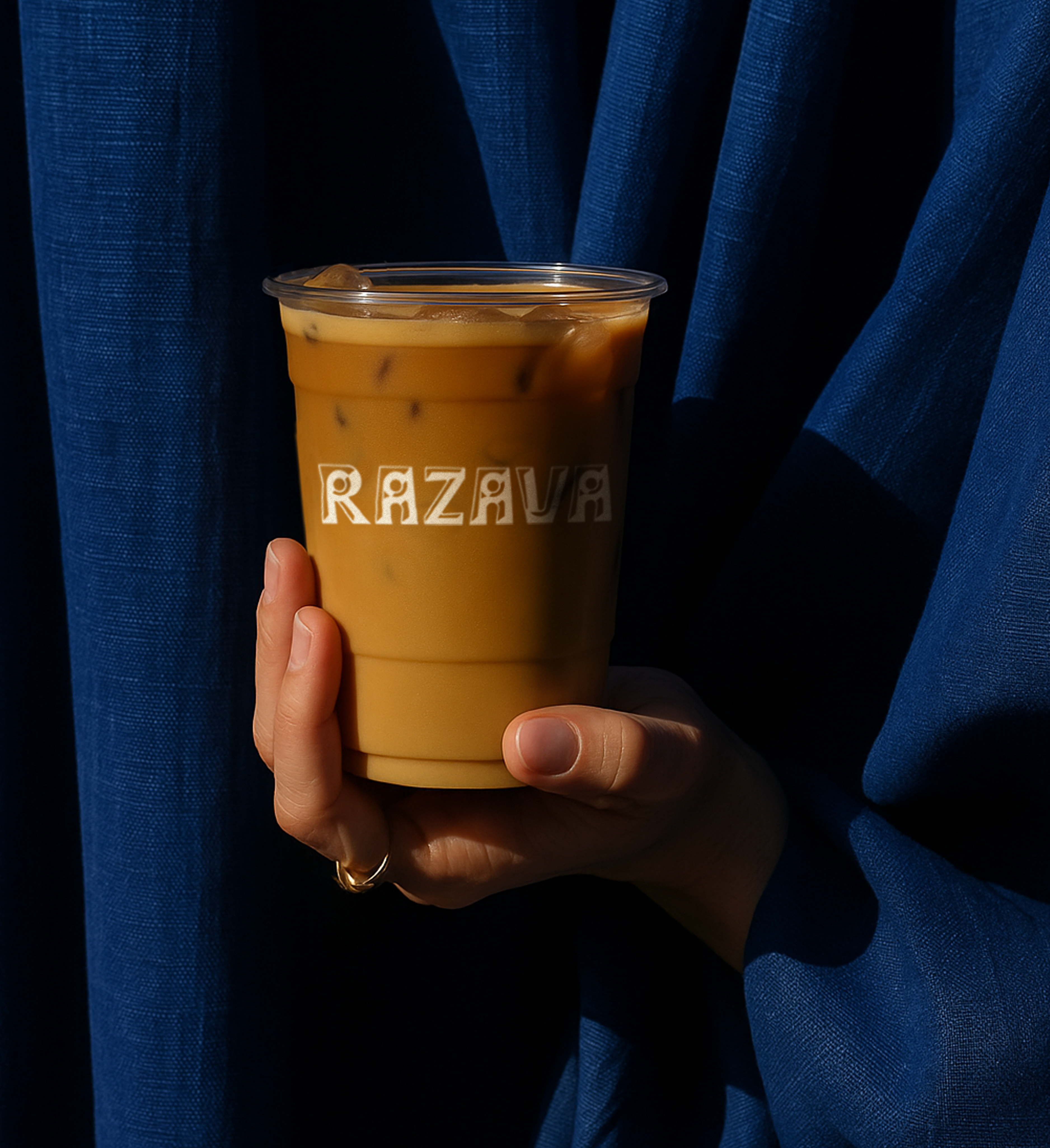
Razava sans is a crafted custom typeface, shaped by the very bread it represents—its rough edges and organic forms mirroring the textures of a hand-scored loaf. Like the bread, it couldn’t be rushed. It had to be made with intention.
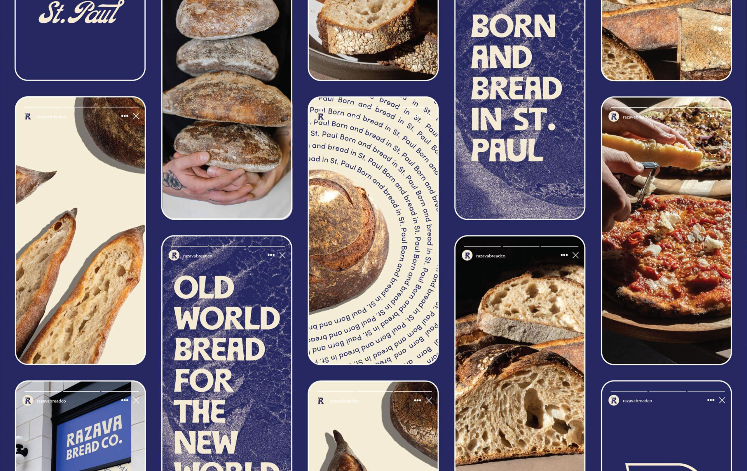
And now, Razava Bread Co. stands as more than a bakery. It’s a commitment to quality, authenticity, and the simple joy of sharing something real.
CONTRIBUTORS
Strategy: Victoria Langton
Creative Direction: Jack LeWin
Design: Jack LeWin
Copywriting: Eric Luoma
Interiors: ESG Architects